Development of a brandbook and UX/UI design for the IT agency Frogect
2026 year
Services
- Logo
- Brand Identity
- Brand Book
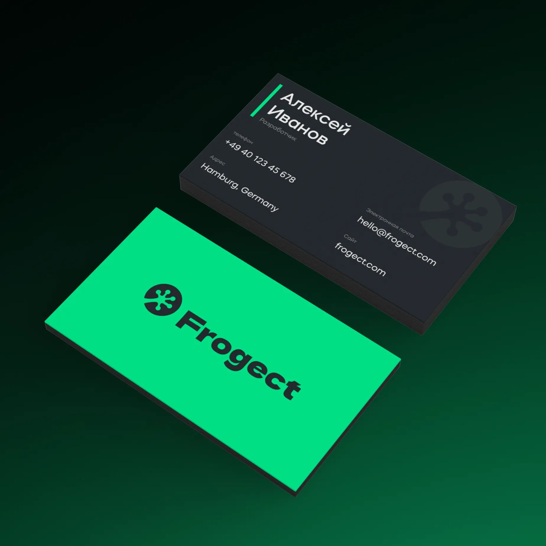
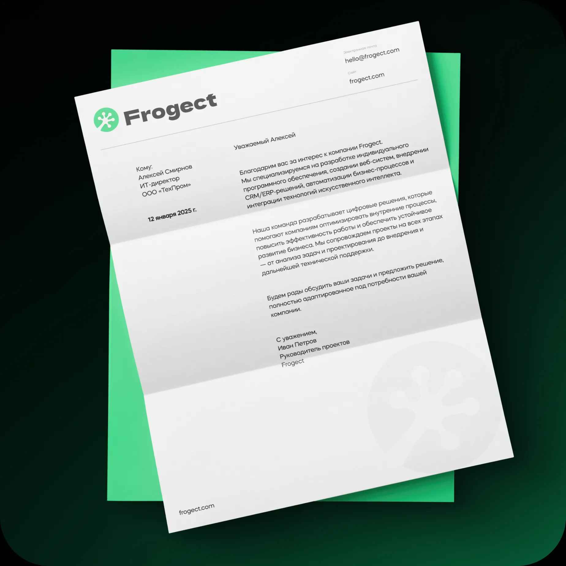
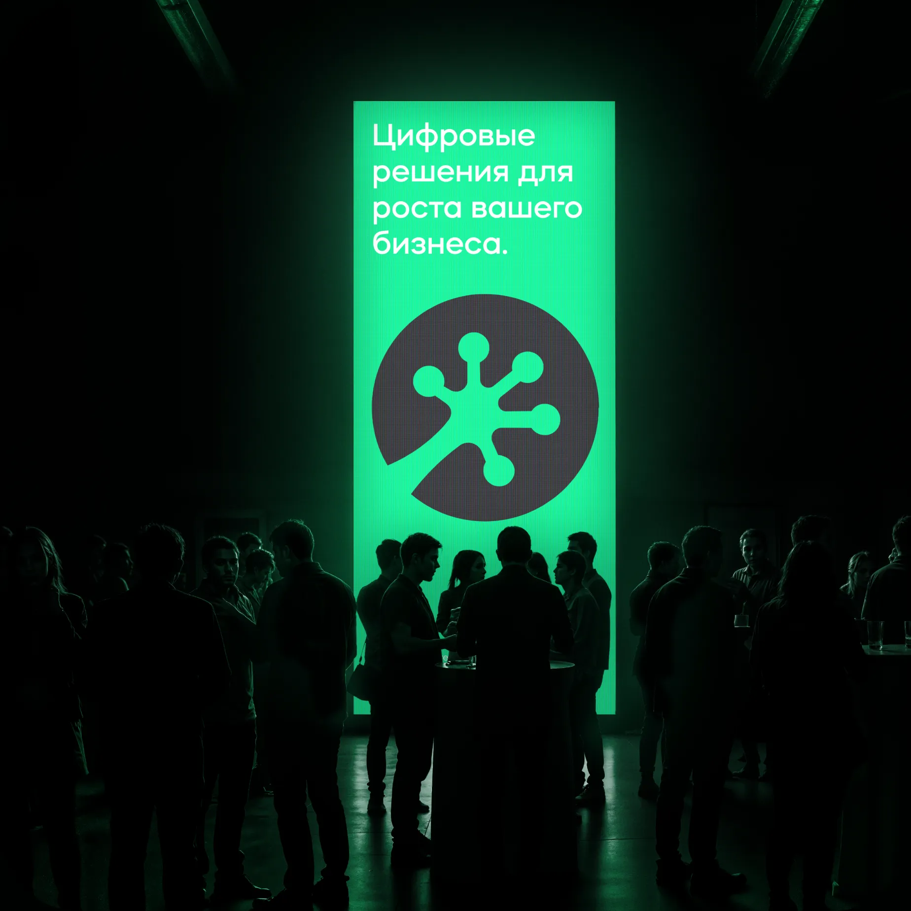
- Media
Industries
- Information Technology
Launching from scratch.
Looking like an agency,
that people trust.
Frogect — an IT agency from Hamburg that specializes in custom software development, web systems, CRM/ERP, automation, and AI integration. Their clients are medium and large businesses in Germany that need a digital partnership, not just a contractor for a project.
The team came to us without a visual identity. No logo, no branding — just a strong product and expertise. The task was clear: to enter the German market and convey reliability, modernity, and technical depth from the very first touchpoint. In the B2B segment, identity is the first filter of trust even before a conversation with a manager.
What was there before
A blank visual foundation. Just a name, the team's expertise, and the ambition to enter the German market.
What needed to be done
A logo, a system, and guidelines — within 4 weeks. Before the website launch, client presentations, and initial negotiations.
Protection Area
This is the minimum required space around the logo. When using the logo or symbol, always maintain the protection area.

Protection area of the mark
When using the mark, the same rules apply as for the full version of the logo.

Process
Three weeks of searching One final solution
-
01
Research and Competitive Analysis
We studied over 40 branding identities of IT agencies and service companies in the German-speaking market. We created a map of visual territories. We found an open space — technically convincing, yet lively.
-
02
Three Sign Concepts
The geometric frog is too literal. The F-shaped abstraction is too cold. A hybrid star symbol with organic movement is just right. The client chose the third option: it was the only one that worked at 16px and on the sign at the same time.
-
03
Font search
We tested 12 typefaces. We settled on Mazzard — geometrically strict but with warm details. It conveys exactly the feeling the partner needs, not just what the executor needs.
-
04
System Assembly and Brand Book
Two final rounds of edits on color, security fields, and versions. Layout of the brand book with examples of violations. Transfer of source files to the Frogect team.
Days 1–3
Brief and strategy
Days 4–10
Concepts of the logo
Days 11–17
Final logo
Days 18–25
System and carriers
Day 28
Brand book submitted
Fonts - Mazzard
Mazzard Bold
Mazzard Regular
abcdefghijklmnopqrstuvwxyz ABCDEFGHIJKLMNOPQRSTUVWXYZ 1234567890!@#$%&=/-+
Color Palette
#2C2E30
RGB 44 46 48
CMYK 8 4 0 81
HEX #2c2e30
#0CE489
RGB 12 228 137
CMYK 95 0 40 11
HEX #0ce489
#FDF9F1
RGB 253 249 241
CMYK 0 2 5 1
HEX #fdf9f1
Audience and Market
German B2B Market Doesn't forgive weak branding
The target audience for Frogect includes IT directors, operations managers, and owners of medium-sized businesses in Germany. These are people who make partnership decisions based on trust. The first impression is formed before the call — through the website, the business card, and how the logo looks in the email signature.
The competitive landscape is divided into two camps: large German IT integrators with heavy corporate branding and small agencies with faceless minimalism. Frogect needed to occupy a third position — technically rigorous, yet vibrant. A partner, not a contractor.
T-System /
Capgemini
Corporate, heavy, impersonal
Small
IT agencies
Neutral, cheap, forgettable
Frogect
Expert, lively, modern
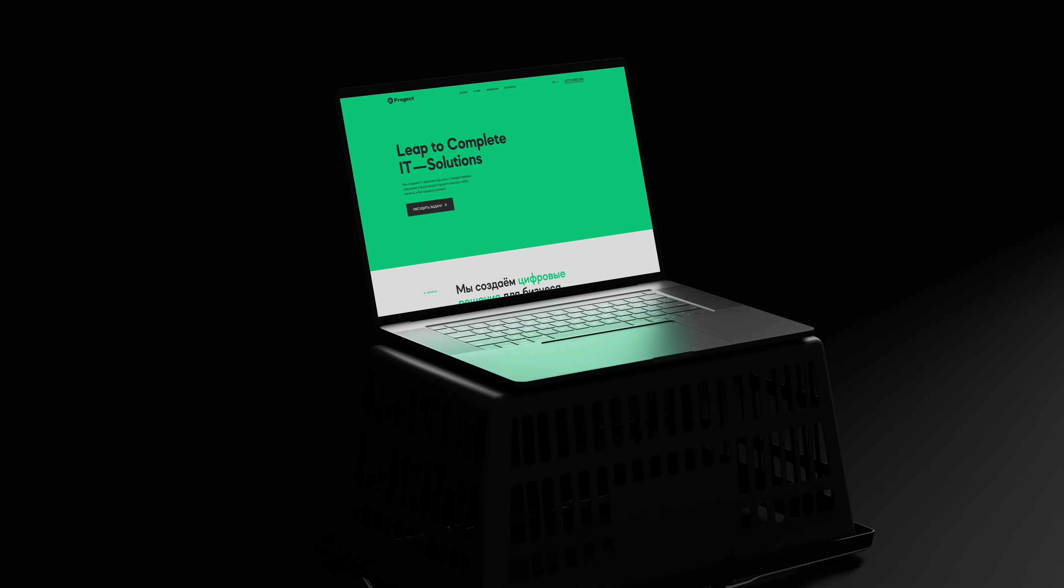
Carriers
System in Action